
3 DIY-Friendly Home Transformations That Yield Wildly Dramatic Results

Photo: Dessa Lohrey
All the fun of before-and-after home transformations is seeing how drastically different a space can look over the span of a few days, weeks, or months. Even more satisfying is when you’ve dressed up those walls, muscled in the furniture, and gotten your hands dirty with paint and woodshop-type hacks all by yourself. Sometimes all it takes to get to the finish line is a road map, the right inspiration, and lots of advice from people who are seasoned pros at this kind of thing.
To that end, we’re looking back at some of our favorite jaw-dropping revamps from Reno Diaries of the past and taking notes on what worked, along with how they came together. We asked three creatives who pulled off some of the most dramatic home transformations to share their recipes for success with the most DIY-able aspects from each project. From large-scale murals to squiggle backsplashes, corkboard walls, and splashy color schemes inspired by La Croix packaging—here’s how to plan out a similar home transformation that will make you feel like you’ve stepped into a different space entirely.
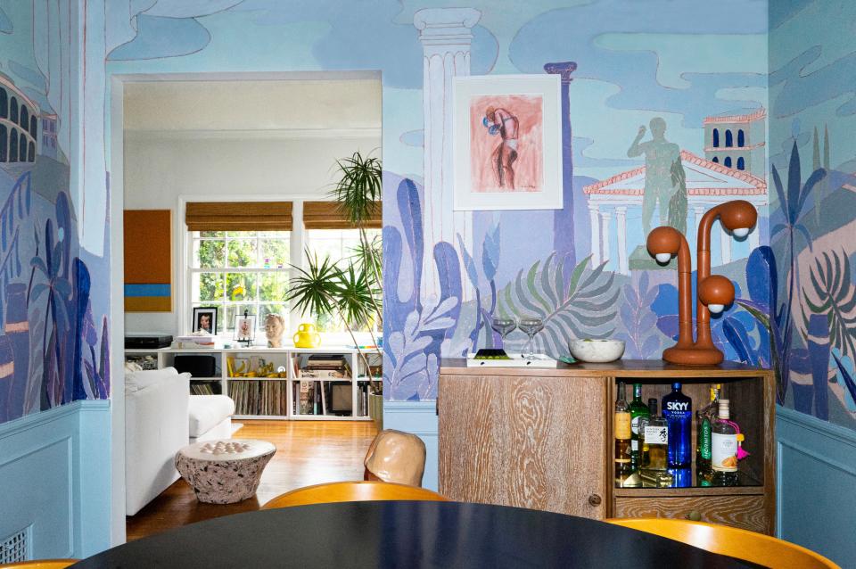
The Dining Room: A “Go Big or Go Home” Nature-Inspired Mural
For a dark 120-square-foot dining room that doesn’t get much natural light, doing much else to dress up its bland, terra-cotta color besides paint wasn’t an option in this LA rental shared by muralist Thomas Rodehuth and interior designer Jake Harrison. For Rodehuth, a natural inclination was to cover the walls in one of his colorful landscape murals. This one in particular features 360-degree wall-to-ceiling painted art inspired by the French cartoon Asterix; he wanted it to look like a view from a garden pergola overlooking the surrounding countryside.
Rodehuth used a base shade, Backdrop’s Early Stuff, then painted all the other blue tones over those, keeping the other art in the room fairly minimal to avoid the room looking too busy. The total cost didn’t come to more than $100, including $75 for paint and other supplies, like drop cloths.
Before committing to a big mural for your first time, Rodehuth recommends sketching it out first either on a piece of paper, virtually via iPad, or directly on the wall before painting over it. “Imagine the wall as a big canvas and really start with a composition of elements first before you worry about details,” Rodehuth says, then experiment to find out what techniques you like, whether that’s a certain brush technique or crayons drawn on the wall like child’s play.
If paint is involved, he suggests canvas drop cloth—“don’t get the annoying plastic sheets”—and making sure you have enough of each paint color for touch-ups at the end, noting which paint colors of a specific brand you chose for each element of the mural. Rodehuth also adds that color fans or paint sample cards laid out in front of you can help you narrow down complementary hues. “Mix and match until you have a well-composed color story,” he says. “Don’t rush it, take your time.”
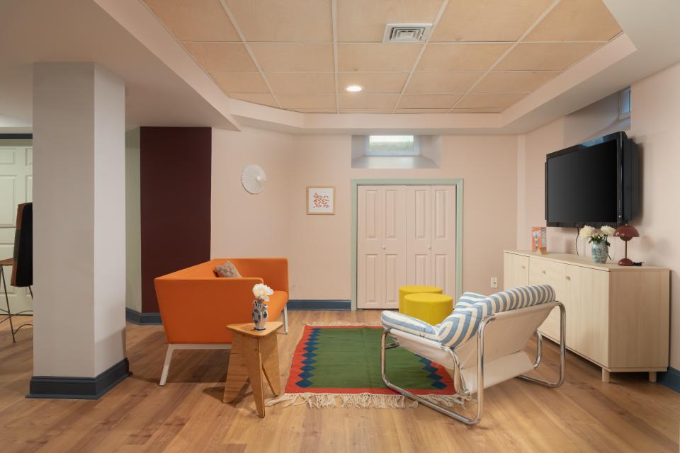
basement renovation refresh
The Basement: Color Zoning and Wacky Wall Coverings
When Maplewood, New Jersey–based interior designer Hollie Velten-Lattrell was called in to revamp a basement flooded by Hurricane Ida, she wanted to infuse the space with the kinds of colors that would liven up its grim interiors and section off the place—previously a fun house of “creepy” doors—so each living area could serve its own distinct purpose.
Velten-Lattrell landed on a “color folding” technique—inspired by Bauhaus Master House No. 3—that she says is slightly more subtle than color blocking. There’s contrast, but the intent is to connect, not to make anything “pop.” She explains that the trick is to fold more of the neutral colors in wider spaces and transition between them with darker and moodier colors on smaller, asymmetrically placed walls or soffits. “You want a sense of continuity and movement, not an isolated accent wall,” she explains, adding that Farrow & Ball’s Preference Red was her bold segue of choice for this project. In the homework and craft zone for the clients’ kids, a floor-to-ceiling cork wall for tacking up notes, calendars, and artwork helps distinguish this as a place for work and play. “We love a more organic bark and rock-like cork pattern to really warm up the space, treated with contrast trim along the baseboard.”
Seating was another touchpoint used to distinguish one space from another, both functionally and aesthetically. Take the cushy striped cantilever chair in the communal space that looks made to sink into versus the counter-height table and chairs in the dining area. On the far side of the basement, built-in plywood seating forms a gathering space (or a “cozy cocoon,” as Velten-Lattrell calls it) for reading, storing things out of sight, and nestling under the window.
Elsewhere, a DIY wood backsplash in the kitchen helped the team save heaps of money on the remodel. “When the countertop quote came in too high, we decided to fabricate a scalloped piece in plywood, painted with a sealer and in the color of the cabinets, to look more built-in,” Velten-Lattrell says. A similar design could be made with just a jigsaw tool, though she insists a curved edge will always be easier to achieve than multiple scallops. “Just make sure to use cabinet-finish paint and sealers,” the designer emphasizes.
Other creative custom designs include the open shelving in the kitchen area and a wall-length pegboard for hanging and drying items like laundry and bags. For the shelving, Velten-Lattrell suggests either plywood lumber (thick 2.5-inch boards, specifically) and brackets or buying a whole system at Shelfology and mixing it up with fun hardware. The laundry pegboard can also be achieved with wood and dowels. Velten-Lattrell’s tip? Keep the dowels thick, chunky, and modular, so you can move them around as needed depending on the size of the item you’re hanging. “We always like live-edge banding exposed on wood,” she adds.
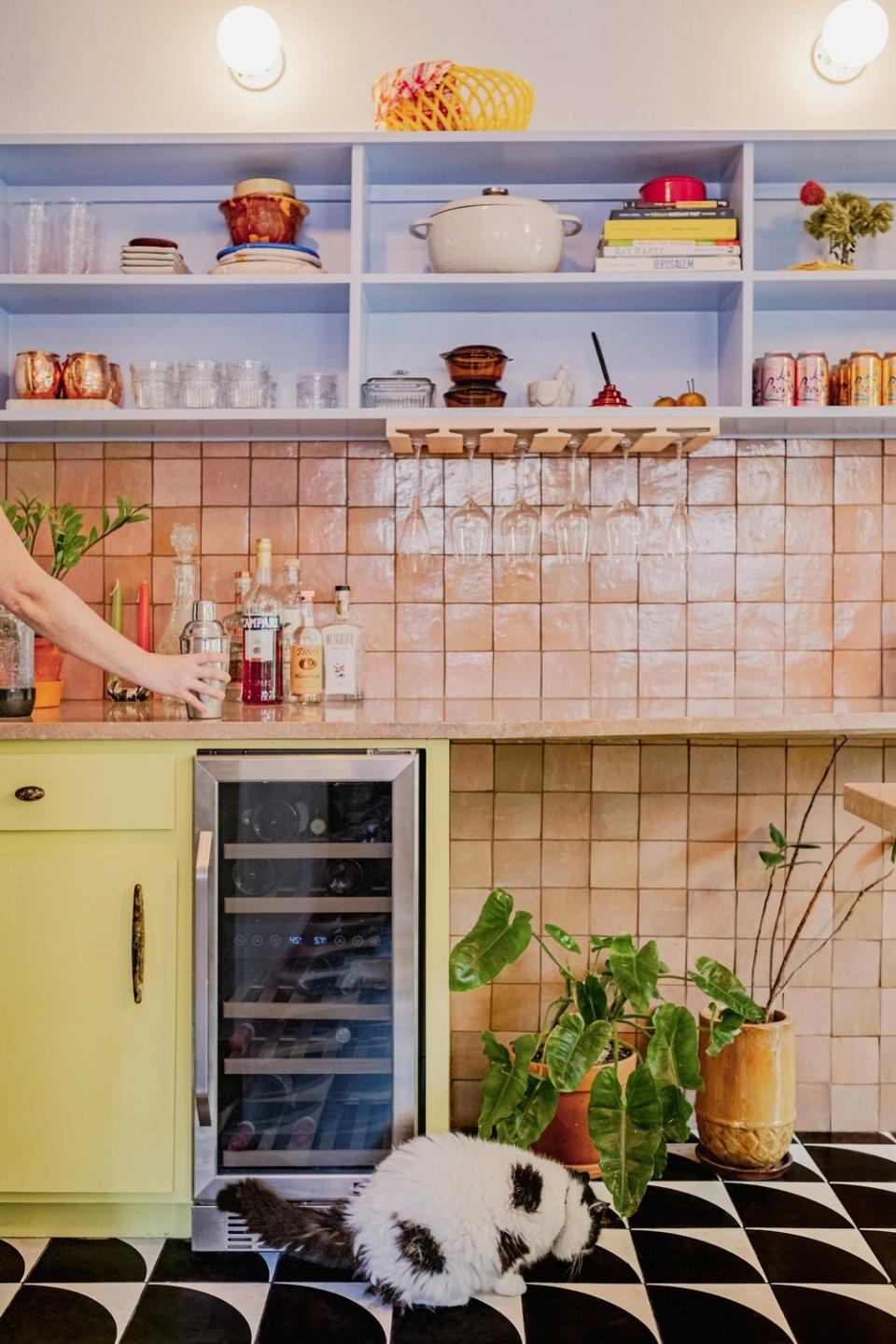
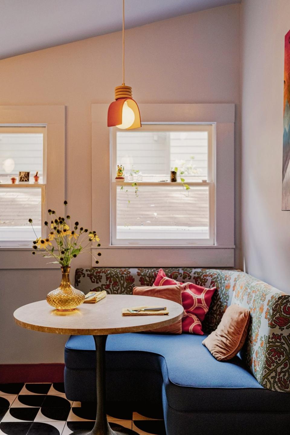
The Kitchen and Backyard: An Indoor-Outdoor Layout That Leans Into Maximalist Color and Cohesion
Cramped, ill-planned kitchens are the scourge of even the most attractive homes on the market, and unfortunately for a homeowner living in a ’30s house, none of the previous occupants had thought to renovate the kitchen before she bought the place. With the help of her friend Jennifer Martin, who runs Atlanta’s Martin Rickles Studio with cofounder Carley Rickles, a big overhaul inspired by La Croix packaging was able to give the home cohesion and connect the kitchen with the backyard that it looks out on. Budget-friendly open shelving now installed around the sink facing the yard maximizes daylight, and the newly renovated deck (replacing a traditional elevated design with wraparound stairs) gradually terraces down the backyard instead. The deck transformation “allowed us to avoid the need for railings, which would have blocked the view to the ground and cut the yard off from the kitchen and deck.”
The kitchen was fully gutted before finishes and cabinetry could be installed, but Martin says a splashy design scheme like the one seen here can be achieved without professional help if you plan it from multiple angles. “Multicolored palettes can be very difficult to pull together if you’re not used to thinking about color in space,” she says, such as “how colors and textures will respond to natural and artificial lighting, how the combination of colors will create certain responses and feelings, and the impact of scale.” Martin recommends commiting to ideas that excite you from the beginning (like a beautiful pink stone countertop) and go from there.
Once you’ve honed in on that one defining detail, you can start to imagine how other colors and materials might feel in juxtaposition. “Give yourself permission to play devil’s advocate and see what happens,” Martin advises. “Sometimes a palette will come together right away, and other times it’s not so straightforward.”
Martin and Rickles also like to get creative with common materials, like the scalloped brick edgers surrounding the entertainment area of the yard—culled from a hardware store because of their playful shape and color. For the tiled surfaces in the kitchen, concrete floor tiles and pink zellige tiles on the wall were also both ordered from Riad, Martin explains, in order to minimize the cost of ordering from multiple places (which can be a big expense, she notes).
The black-and-white color scheme on the floors was selected for its likeness to the client’s cat Oats and arranged just so to resemble his face and ears. For these types of aesthetic decisions, Martin says sometimes you’ve got to go with your gut on what looks good and what makes you feel better about the space you live in. “If you don’t have a hype man then be your own! That’s really the most important thing.”
Originally Appeared on Architectural Digest

